3. Levels, shades, and grids
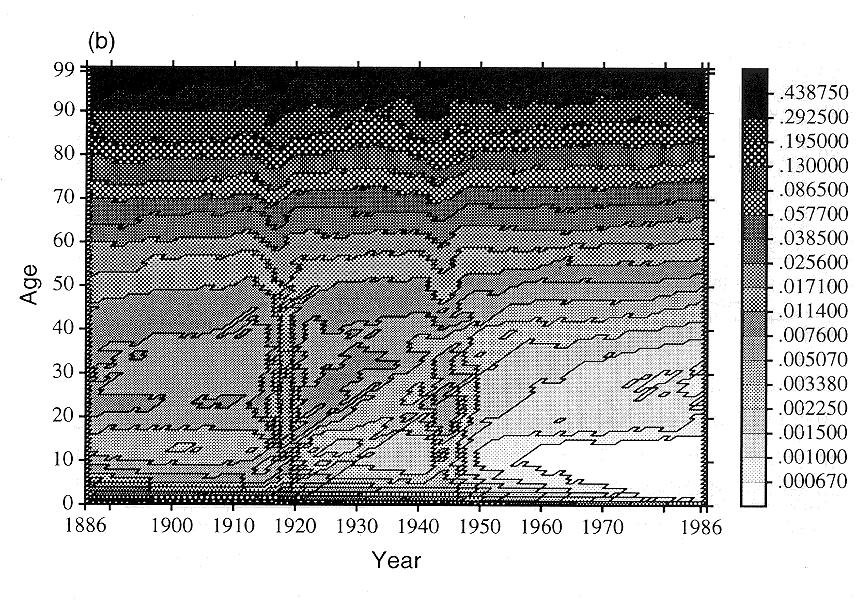
An important consideration when designing a contour map is how many different levels to use. The LEXISMAP computer program that we employed to draw the maps allows, among other possibilities, lines to be drawn at 17 levels, separating the surface into 18 tiers. Use of fewer lines sacrifices detail, whereas use of more lines tends to make the map less intelligible: 17 levels is a reasonable compromise, although the use of 10 or 20 levels might be considered. Delaporte (1941) draws lines at 19, 20, or 21 levels on his various maps of European mortality; many of the figures in this monograph use fewer than 17 levels. Figure 1(c) presents the contours of Italian male mortality using 10 levels rather than the 17 levels used in Figure 1(b).
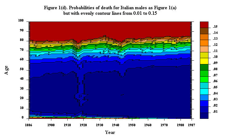
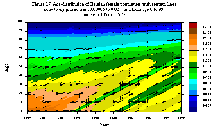
Which specific elevations the contour lines should connect is a second important design decision. On mortality surfaces, where probabilities might approach a minimum of the order of magnitude of 0.0001 and a maximum of 1, use of equally spaced lines-say at 0.01, 0.02, and so on up to 0.15-results in a map where the contours are clumped together at the youngest and oldest ages, with a largely empty expanse in-between. Figure 1(d) illustrates this for Italian male mortality. The map is far more informative when the lines are spread out at constant multiples-e.g., each line representing a level 50% higher than the previous line, as in Figure 1(b). Alternatively, a convenient scale can be used: Delaporte places his lines at levels of mortality of 1, 2, 3, ..., 9, 10, 12, 15, 20, 30, 50, 100, 150, 200, 250, 300, 350, and 400 per thousand, and in several figures in this monograph, including Figures 5 and 17, contour lines are selectively placed at convenient levels.
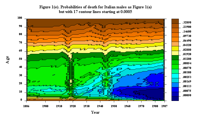
Shifting the location of contour lines can make a difference in the appearance of a Lexis map, especially in the details. The map in Figure 1(e) provides an example. Compare, for instance, the region from 1920 to 1930 from age 20 to 30 on Figure 1(b) and (e).
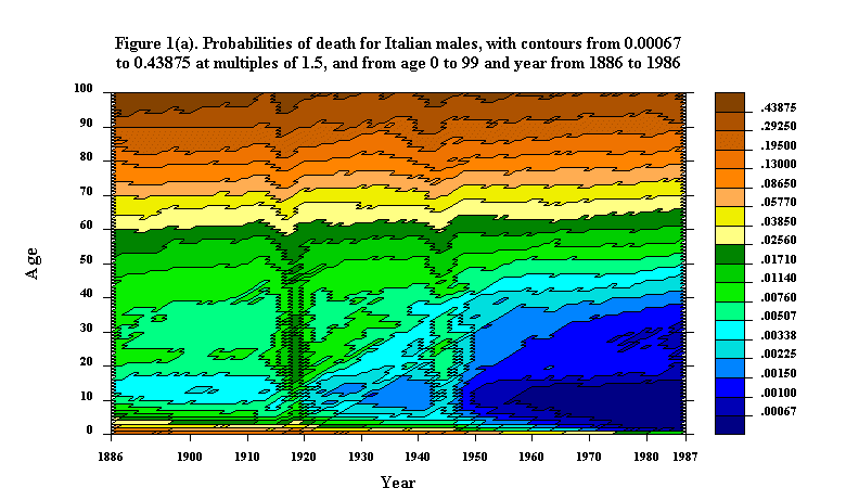
Demographers often work with transformations, such as the log or logit, so it might seem reasonable to transform the surface q(x,y) into the surface of, say, log q(x,y) and then to draw level lines at equal intervals on the transformed surface. If the transformation is monotonic, like the log or logit transformation, an identical contour map can be drawn by spacing the level lines at appropriately unequal intervals on the original surface. In the case of logarithms, the level lines should be multiples of each other rather than being equally spaced. Thus, the map in, say, Figure 1(a) can also be interpreted as depicting log probabilities of death.
A key feature of the LEXISMAP computer program we developed is the shading of regions according to the height of the surface. The shading varies from light to dark or from deep purple to deep red as the surfaces rise from low to high levels of mortality. Such shading, which is time-consuming to do by hand but easy with the help of a computer, makes the overall pattern of a mortality surface more immediately comprehensible, especially if the map is viewed at a distance. At the same time, the details of small peaks and pits and of the twists and turns of the contour lines are still there to be scrutinized at close range. Literature, critics note, can be profitably read at different levels of understanding; we suggest that the reader try viewing Figure 1(a) and perhaps some of the other figures in this monograph at levels of 25 cm and 5 m.
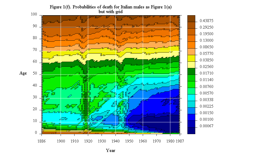
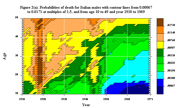
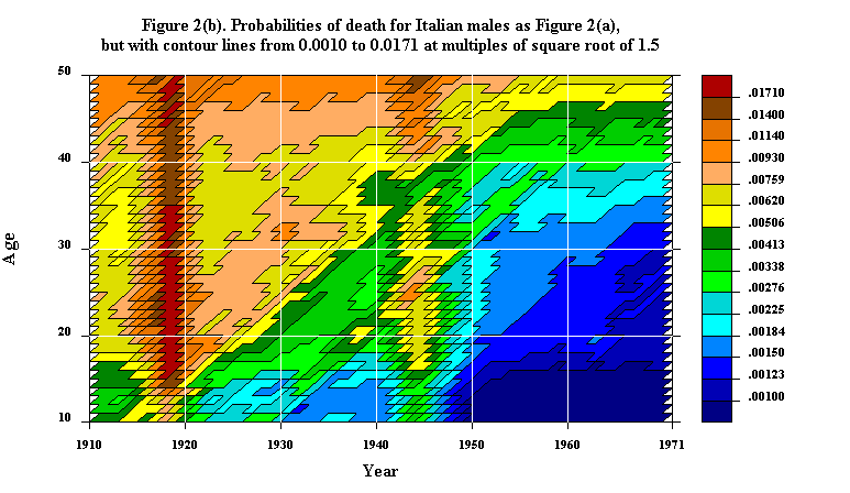
Sometimes it is useful to draw a grid on a contour map so that the coordinates of various points can be conveniently located. In Figure 1(f) the map in Figure 1(b) is redrawn with a superimposed grid every 20 years of time and age. The grid detracts a bit from the underlying pattern-that is the price of adding additional information. Grids are also included in Figures 2(a), 2(b), and 28.
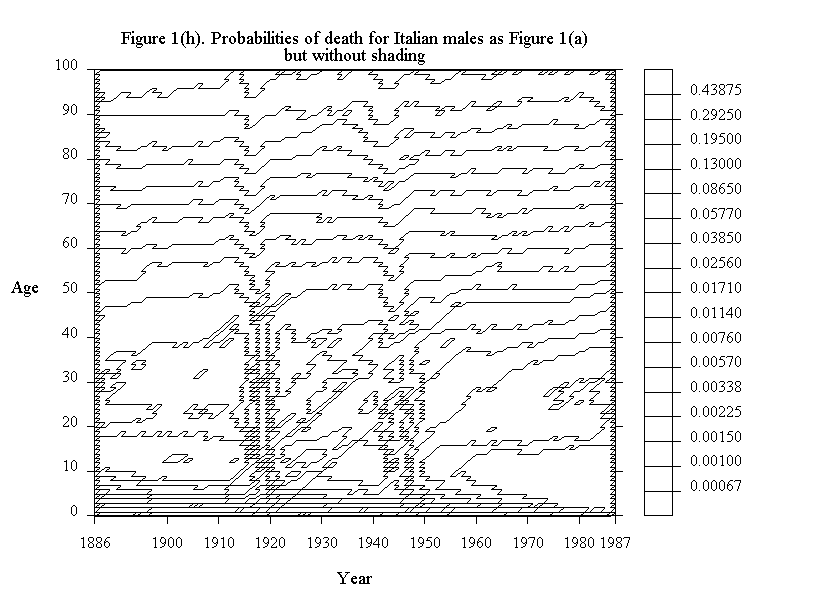
To see general trends it may be helpful to suppress the contour lines in a map of a population surface. In Figure 1(g) the map in Figure 1(b) is redrawn with shading but without lines. Alternatively, one could draw a conditional contour map with lines but without shading. Figure 1(h) displays such a map for Italian male mortality. The lines in this figure are not labelled, but they could be.
Updated by L. Andreeva, 23-Sep-1998