10. Relative surfaces of Italian mortality, US fertility, and Belgian population
Two applications of relative contour maps are shown in Figures 14 and 15. Figure 14 displays age-specific probabilities of death for Italian males relative to their levels in 1925, a year roughly halfway through the period studied. The map clearly reveals the great progress that has been made in reducing mortality at the youngest ages compared with the slow progress at the oldest ages. The map also puts the devastation of World War I into perspective: World War I essentially erased a half century of progress, but the setback was temporary and pre-World War I mortality rates at most ages were achieved and surpassed within a decade or so.
Figure 15 presents age-specific birth rates for US females relative to their level in 1980. The map highlights the dramatic reduction before 1980 in birth rates above age 35, compared with the less radical (relative) changes at younger ages. Even the baby boom pales in significance when viewed from this perspective. The map also highlights the increase in fertility after 1980, especially at older ages.
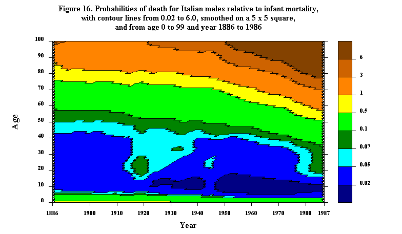
Instead of dividing a demographic array by the age-specific statistics for a particular year the array could be divided by the period-specific statistics for a particular age. For example, Figure 16 shows probabilities of death for Italian males at various ages relative to infant mortality in the appropriate year. The map is smoothed, with averages being taken over 5 x 5 squares of age and time: this smoothing reduces mortality at age 0. The falling contours on the top half of the map emphasize a trend that was less apparent in Figure 1(b), namely that progress against mortality at older ages has been slower than that at younger ages. In 1886, death rates at age 80 were less than the level of infant mortality; a century later, death rates at age 80 were more than 6 times higher than the prevailing infant rates.
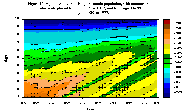
Demographic statistics can also be expressed relative to some composite age-specific or period-specific measure. Figures 17 and 18 provide two examples. To produce Figure 17, Belgian age-specific female population levels (from Veys, 1983) were divided by the total Belgian female population in each year. Thus the map gives contours of the age distribution of the population, i.e., the percentage of the population in each year that are at various ages. The diagonal traces of the small cohorts born during World Wars I and II are apparent, as is the general trend of the age composition of the population to shift upward to older ages. As a proportion of the population, 70-year-olds were as important in 1970 as 40-year-olds were in 1892.
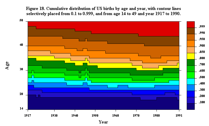
Figure 18, which is based on US fertility data, is similar in nature except that the contours pertain to cumulative levels up through age 49 relative to the total level over all ages. The map can be interpreted as showing the proportion of all births in a given year that occurred to women of some age or less - in a synthetic population in which there were equal numbers of women at each age. The general trend is downward, especially at older ages: a greater cumulative proportion of children is being born each year to younger women. This trend runs through the periods of baby boom and bust, but there is some reversal of the trend between ages 25 and 35 after 1980.
Finally, it may sometimes be useful to examine Lexis maps based on statistics relative to a cohort-specific measure rather than either an age-specific or period-specific measure. Consider, for instance, Figure 19, which is similar to Figure 18 except that cumulative fertility is computed relative to total cohort fertility up through age 49. The general trend is up, then down. Consider, for instance, the .5 contour line. For the 1903 birth cohort, this contour line indicates that half of the children were born by age 26. For the cohorts born around 1915, half the children were born by age 27, whereas for the cohorts born in 1941, half the children were born by age 24.
Updated by L. Andreeva, 23-Sep-1998