4. Smoothed maps
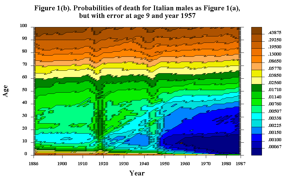
It is useful to take a close look at the small blemishes isolated from contour lines on a Lexis map, because these spots indicate outliers-very localized peaks or pits-that might be due to erroneous data values. Consider, for instance, the black rhombus in the first graph of Figure 1(b) at age 9 and year 1957: it turns out that this blemish was, indeed, produced by an error made in transcribing the Italian mortality data to a computer tape. (The error was corrected, but we have left the spot as an illustration). On the other hand, the mark at age 19 in 1962 represents a point where the mortality surface barely crosses a contour level, like the top of a sea mount that appears as a small island just rising above the level of the surrounding ocean.In addition to these blemishes, some cluttered areas appear in Figure 1(b). These represent virtual plateaus where the mortality surface is repeatedly crossing and recrossing a level line, or cliffs where mortality rates are rising or falling rapidly. To reduce this kind of noise and to suppress the details of local fluctuations so that the global patterns can be more clearly perceived, it may be useful to smooth a surface. Delaporte (1941) presented both raw and smoothed contour maps of mortality in various European countries: on his "adjusted" maps, he drew smooth contour lines based on his feeling for the data. We used a mechanistic, computer algorithm to produce the smoothed map shown in Figure 1(i). In the smoothed map the height of the surface at age x in year y was replaced by the average of the 25 heights in the 5 x 5 square of points from (x - 2) to (x + 2) and from (y - 2) to (y + 2). On the edges of the map, where a full 5 x 5 array of data points is not available, the smoothing procedure averages the available data.
Instead of smoothing by averaging over a 5 x 5 square, a larger (or smaller) square might be used. In Figure 1(j) Italian male mortality is smoothed on an 11 x 11 square. Global patterns in this map are somewhat clearer than in Figure 1(i), but some interesting local detail is lost and effects that are concentrated in time or age, such as infant mortality and mortality during the 1918 Spanish influenza epidemic, are smeared out.
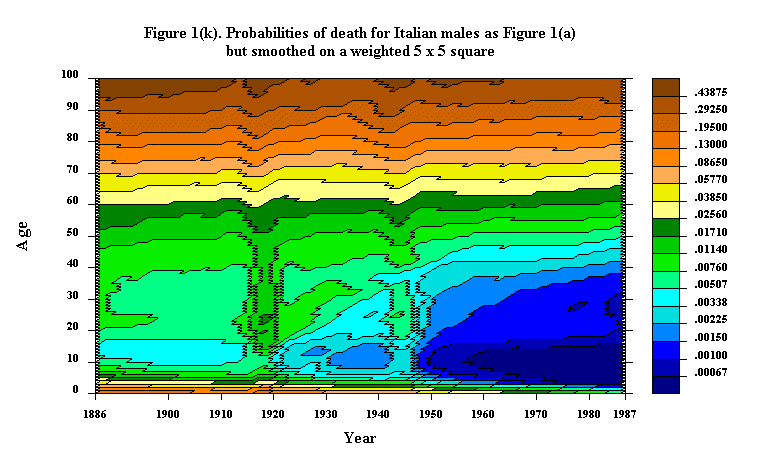
A variety of alternative smoothing procedures might be used, including procedures that replace points by a weighted average of adjacent points, the weights diminishing with distance. Figure 1(k) presents a map of Italian male mortality smoothed by an algorithm in which the weights given to the points in a 5 x 5 square were proportional to the matrix:
1 4 6 4 1 4 16 24 16 4 6 24 36 24 6 4 16 24 16 4 1 4 6 4 1
Thus, the points in the corners of the square were given weights of 1/256, whereas the point in the center received a weight of 36/256. The theoretical advantages of such weighted smoothing algorithms (see Tukey (1977) for an introductory discussion) have to be balanced against the conceptual simplicity and computational convenience of the kind of straightforward averaging illustrated in Figures 1(j) and 1(k).
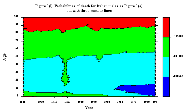
By using fewer contour lines, a less busy and hence smoother-looking Lexis map can usually be produced. Figure 1(l) illustrates of an extreme example of this approach: Italian male mortality is represented on a Lexis map on which all but three of the contours (and four of the levels) have been suppressed. The map, in its simplicity, strikingly highlights the rapid progress against mortality at younger ages, especially after World War II, in contrast with the slower progress at older ages.
Updated by L.Andreeva, 23-Sep-1998