18. High Danish mortality
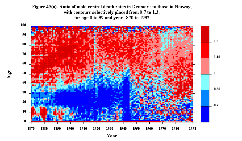
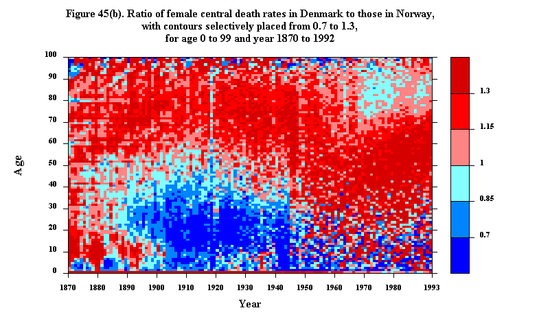
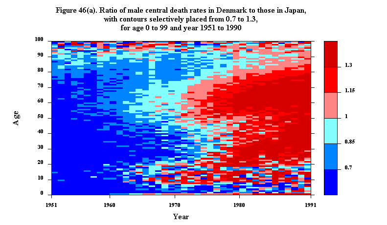
Danish life expectancy used to be among the highest in the world; now it falls below that in many other developed countries. Current Danish mortality, expecially for people in their 30s through 60s, tends to be relatively high compared with mortality in Sweden, Norway, the Netherlands, and various other countries. This unfavorable development has excited considerable concern in Denmark and has led to an array of research projects, including a project by three of us (Andreev, Vaupel, and Yashin) and others at Odense University Medical School. To deepen understanding of Danish mortality relative to mortality in other countries, we are preparing Lexis maps of ratios of mortality in general and of mortality from specific causes, such as cancer or heart disease. Figures 45 and 46 illustrate this line of inquiry. (Lexis maps of mortality and fertility ratios were earlier discussed in section XII of this monograph.)
Figure 45a displays the ratio of age-specific central death rates for males in Denmark vs. Norway, from 1870 through 1993. Figure 45b presents a similar map for females. The red colors indicate higher mortality in Denmark than in Norway; the blue colors indicate lower mortality in Denmark. The darkest red and blue tones denote the ages and times when the discrepencies were greatest.
Figures 46a and b are analagous, except they pertain to differences between Denmark and Japan and they cover a much shorter time period--from 1951 through 1991.
Consider, first, the comparison of male mortality in Denmark vs. Norway. Up until and particular during the Second World War, Denmark enjoyed a substantial advantage at ages under 40 or 50. In contrast, Norwegian mortality tended to lower than Danish mortality at older ages up until the mid 1940s, with the striking exception of 1918, the year of the Spanish Influenza epidemic. Over the past half century, both the Danish advantage at younger ages and the Norwegian advantage at older ages have tended to diminish. Between the ages of 30 and 50 there has been a reversal of advantage: between 1920 and 1945 Danish male mortality at these ages was considerably lower than in Norway, but since 1975 it has tended to be considerably higher.
For females in Denmark vs. Norway the general patterns are roughly similar to the male patterns but with bigger, more striking changes. Note, in particular, the large area of relatively high Danish mortality among middle-aged women that emerges after the Second World War: by 1993 at most ages between 35 and 75 Danish female death rates were more than 30% higher than Norwegian rates. At least some of this domain of disadvantage appears to follow particular birth cohorts. Consider, for instance, the women born in 1930 and age 63 in 1993. This cohort suffered relatively high mortality in almost every year from the mid 1950s.
The map comparing Danish and Japanese males, Figure 46a, also contains some suggestive diagonal blotches of red. The cohorts born around 1960, for instance, who were in their late 20s or early 30s in 1991, had much higher mortality in Denmark than in Japan from age 20 on. Further analysis is needed to determine how much of the explanation lies in Danish vs. Japanese mortality trends. Figure 46b, which compares Danish and Japanese female mortality, also contains some hints of cohort patterns. The growing domain of severe Danish disadvantage, starting around age 50 around 1970 and expanding to ages 30 to 80, could also be interpreted as an epidemic-like pattern resulting from the spread of Danish negatives (or, perhaps, Japanese positives) to adjacent age classes.
Viewed in their entirety, the Danish-Japanese comparisons are mostly blue before the early 1970s and mostly red thereafter. The very substantial Danish mortality advantage in earlier years turns into a very substantial Danish mortality disadvantage in more recent years. Japan not only caught up with Denmark but went on to do significantly better than Denmark for both sexes and at almost all ages.
Further analysis of other mortality comparisons--of Denmark with other countries and Japan with other countries--as well as comparisons of cause-specific mortality could shed new light on how Denmark might reduce death rates. The Lexis maps in Figures 45 and 46 are not only dramatic graphical presentations: they communicate an enormous amount of information in a thought-provoking way.
Updated by L. Andreeva, 23-Sep-1998