7. Maps of female fertility
Figure 5 displays the contours of US birth rates from 1917 to 1990 for women from age 14 to 49; the figure is based on data compiled by Heuser (1976, 1984). In the center of the baby boom, for women around age 23 around 1960, fully a quarter of women gave birth each year. The concentration of high birth rates among women in their early- and mid-20s and the cycles of high and low birth rates that characterize baby booms and busts are strikingly revealed on the map. The color scale in Figure 5 was chosen to allow comparison with Chinese and Finnish birth rates in Figures 8 and 9.
Figure 5 is a standard map in which current year runs along the horizontal axis and age runs up the vertical axis. Other coordinates help reveal cohort effects. In particular, because the eye can follow vertical and horizontal lines more easily than diagonals, it may be useful to twist a contour map so that year of birth, rather than current year, runs along the horizontal axis, as in Figures 6 and 7. Fewer contour lines are plotted in Figure 7 because the lines were otherwise too closely spaced to be intelligible.
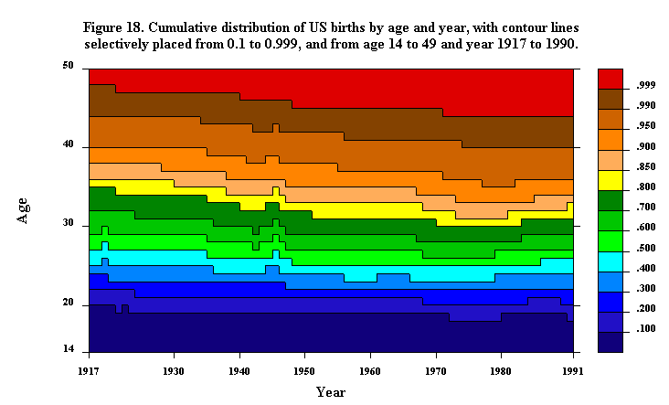
Taken together, Figures 5, 6, and 7 indicate that the age effect in fertility is very strong, that period fluctuations are also strong, but that cohort effects appear to be much less prominent. Perhaps more refined methods of presentation will reveal persistent cohort patterns; some relevant analysis is presented later in this monograph in conjunction with Figures 10, 11, 15, 18 through 20, 27, and 40. Note that the period effects shown in Figures 5, 6, and 7 can be separated into three parts. Before age 18, birth rates have remained low, and after age 35 or so, there is a general pattern of declining fertility up until the late 1970s. It is between ages 18 and 35, and especially around age 23, where the most dramatic absolute swings in fertility have occurred. In conjunction with Figure 15, we will consider relative fluctuations in birth rates, in contrast with absolute fluctuations shown in Figures 5, 6, and 7.
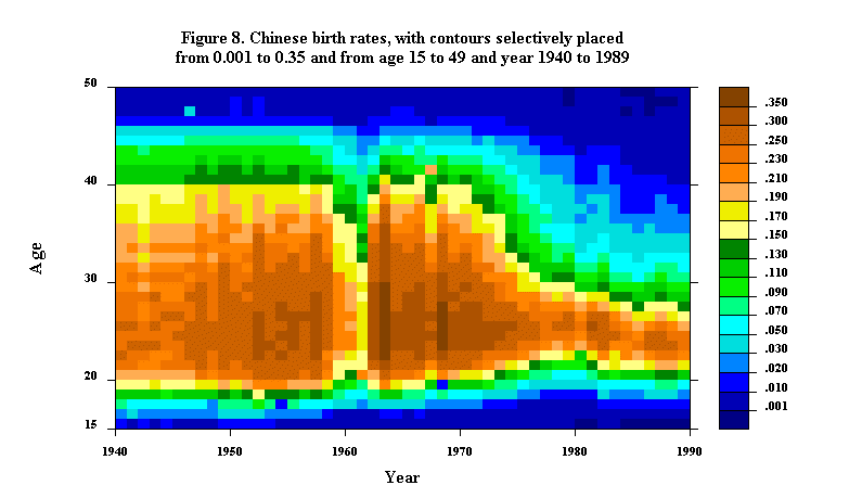
Figure 8 displays a Lexis map of Chinese birth rates by single year of age from 15 to 49 and single year of time from 1940 to 1989; the map is presented and discussed in Zeng et al. (1985, 1994). As discussed in those articles, the most striking feature of the map is the rapid decline in fertility during the 1970s. This decline is well known and often summarized by the dramatic drop in the total fertility rate: in 1970 the total fertility rate was 5.8; by 1981 it had fallen 55% to 2.6. What the map graphically reveals is the age pattern of decline. Consider the ages where the birth rate exceeds 20%: in 1968, this period of high fertility stretched from age 20 through 37. By 1981, in contrast, the period of high fertility was concentrated from age 23 to 27. In 1968, more than 20% of 20-year-olds and more than 10% of 40-year-olds gave birth. By 1981, the birth rate of 20-year-olds had fallen under 10% and the birth rate of 40-year-olds had fallen under 2%. The precipitous decline in the fertility contours at older ages and the marked increase in the contours at younger ages reflect the success of Chinese birth control policy, including the increase in age of first marriage (cf. Figure 29) and, even more importantly, the widespread use of contraception.
The radical narrowing of the period of high fertility was slightly reversed in 1981. Since then, birth rates have remained roughly the same, albeit with some shift to greater fertility at ages 20 - 24. This is partially a result of the New Marriage Law, announced in 1980, and the concomitant boom in marriages, especially among women in their mid-20s.
The most conspicuous period disruption on the map is the trough in fertility in 1959-1961. This coincides with the Great Leap Forward and corresponds to a similar trough in marriage rates, except that marriage rates tended to be lowest in 1959 whereas fertility rates reached their low point in 1961. The recovery of birth rates from their depressed level in 1961 was dramatic: during the prolific ages between 23 and 29, birth rates rose from about 20% per year in 1961 to over 30% per year in 1962 and over 35% per year in 1963.
The fertility data pertaining to earlier years, especially the years before 1950, have to be interpreted with caution since they are reconstructions based on interviews taken in 1982. The general pattern seems reassuringly plausible: over the course of the 1940s and 1950s birth rates were fairly stable, with some tendency toward increase. This is consistent with trends in improvements in living standards, and the absence of widespread contraception, during this period.
Figure 9 shows the fluctuating pattern of Finnish fertility since 1776; it is based on data supplied by Wolfgang Lutz. The various wars and famines that disrupted life in Finland are apparent on the map, as is the substantial decline in fertility after World War I, especially at older ages. Lutz also notes the decline in fertility apparent in the eighteenth century: this represents the culmination of a nuptiality transition starting about 1750.
Updated by L. Andreeva, 23-Sep-1998