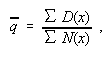
In Chapters 4 and 5, we examined the data for 13 countries, individually. The scatter diagrams in Chapter 5 showed the departures of each of the countries from each of the models at each year of age.
The general pattern of the
departures from the models can be seen even more clearly if we pool the data for the 13
countries and calculate the average force of mortality and the average probability of
dying at each age. We can then fit the models to these pooled data, and compare the models
with the observed average values.
Methodology and data
There are several methods which can be used to fit the models. There are also choices about the age ranges which should be used in the fitting process, and further choices about the way in which the results should be presented. In this chapter, we have adopted the following methods:
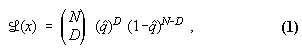
(a) All the models are fitted by the method of maximum likelihood.
(b) In this application, we are effectively dealing with binomial
trials. Persons who reach age ![]() have a
probability
have a
probability ![]() of dying before reaching
age
of dying before reaching
age ![]() . The relevant data at age
. The relevant data at age ![]() are therefore
are therefore ![]() , the number who reach age
, the number who reach age ![]() , and
, and ![]() , the number of these who die before reaching age
, the number of these who die before reaching age ![]() . The pooled data for
. The pooled data for ![]() and
and ![]() in the 13 countries are given in full in Appendix
E, for each of the periods 1960-70, 1970-80 and 1980-90. The appendix also shows the
pooled data for the cohorts born in 1871-1880, though for the reasons explained in Chapter
3 these cover only 11 countries and the data are not complete above age 110.
in the 13 countries are given in full in Appendix
E, for each of the periods 1960-70, 1970-80 and 1980-90. The appendix also shows the
pooled data for the cohorts born in 1871-1880, though for the reasons explained in Chapter
3 these cover only 11 countries and the data are not complete above age 110.
(c ) There is a choice about the age ranges to be used in the fitting process. In this chapter, the models are fitted to the data at ages 80-98 (except for the quadratic model, where the age range is 85-98). The starting age of 80 is simply the lowest age which is included in the data base. An exception was made in the case of the quadratic model because its advocates Coale and Kisker (1990) did not claim that the quadratic model applies below age 85.
The parameters which were found when the models were fitted to these age
ranges are given in Appendix D, together with their standard
errors. These parameters were then used to calculate the expected values of ![]() and
and ![]() , right up to age 120, assuming that the models continue to hold. These
expected values are sometimes described as extrapolations, because they extend the model
to ages above the range to which the parameters were fitted. They can also be regarded as
predictions of the values which will be found at ages 99 and over, according to the model,
given the data at ages 80-98.
, right up to age 120, assuming that the models continue to hold. These
expected values are sometimes described as extrapolations, because they extend the model
to ages above the range to which the parameters were fitted. They can also be regarded as
predictions of the values which will be found at ages 99 and over, according to the model,
given the data at ages 80-98.
The age 98 was chosen as the upper limit for the fitting process deliberately, so that valid comparisons could be made between the predictions and the observed values at ages 99 and over. These predictions, because they are based entirely on the data at ages 80-98, are completely independent of the observed values with which they are being compared. This gives a stringent test of the model.
The choice of age 98 as an upper limit for the fitting process also has the incidental advantage that it avoids any possible errors in the fitted parameters which might result from any age heaping in the data at age 100 or from any other possible inaccuracies in the data above age 98.
(d) Comparisons between the predictions and the observed values can be
made for ![]() or for
or for ![]() or for both. For purposes of presentation,
however, it is easiest to use
or for both. For purposes of presentation,
however, it is easiest to use ![]() .
.
(e) With six models, eight data sets and ages which range from 80 to 120, the volume of output is very large and ways must be found to summarise the results for examination. We shall use three graphical methods, looking at the data from different points of view, in order to show the main features. We shall then apply some more formal methods of comparison, using loglikelihood and chi-squared.
(f) In the comparisons which follow, the expected values of ![]() are calculated from the parameters in Appendix D. The observed values of
are calculated from the parameters in Appendix D. The observed values of ![]() are derived from the data in Appendix E, and the results at ages 80-108 are summarised for
ease of reference in Table 6.1. We stop the table at this point
because above age 108 the observed values of
are derived from the data in Appendix E, and the results at ages 80-108 are summarised for
ease of reference in Table 6.1. We stop the table at this point
because above age 108 the observed values of ![]() at individual years of age are based on small numbers and also the data
are less reliable, for the reasons explained in Chapter 3. (Indeed, this reservation may
also apply to some of the observed values at ages 107 and 108, but these are included in
the table for the sake of completeness).
at individual years of age are based on small numbers and also the data
are less reliable, for the reasons explained in Chapter 3. (Indeed, this reservation may
also apply to some of the observed values at ages 107 and 108, but these are included in
the table for the sake of completeness).
In this chapter, we shall be
solely concerned with comparing the expected values of ![]() , as given by the fitted models, with the observed values of
, as given by the fitted models, with the observed values of ![]() at individual years of age or in 5-year
age groups. Other relevant comparisons will be considered in later chapters.
at individual years of age or in 5-year
age groups. Other relevant comparisons will be considered in later chapters.
Results at individual ages 80-120: Figure 6.1
Perhaps the simplest and most obvious way to display the results
graphically is to plot the expected values of ![]() as given by the models, together with the observed values at individual
years of age so far as they go. The results are shown in this way in Figure 6.1, for each of the eight data sets.
as given by the models, together with the observed values at individual
years of age so far as they go. The results are shown in this way in Figure 6.1, for each of the eight data sets.
We see that on the scales
used in these figures, the six models are practically indistinguishable up to about age
95, but they then start to diverge. At the higher ages, in all eight of the figures, the
highest predictions of ![]() are given by
model G (Gompertz), the next highest by model W (Weibull) and the third highest by model
HP (Heligman & Pollard).
are given by
model G (Gompertz), the next highest by model W (Weibull) and the third highest by model
HP (Heligman & Pollard).
The Gompertz model is always well above the observed values. The Weibull and Heligman & Pollard models are generally above them too, and mostly well above them. The models L, K and Q are generally much closer to the observed values.
This Figure 6.1 is useful in giving a quick general impression of the expected and observed values, but it is important to remember the reservations which apply to some of the individual figures, such as the observed values at ages 107 and 108. More formal comparisons between the models will be given later.
Results at ages 80-98: Figure 6.2
The scales of Figure 6.1 are well suited to show the differences between the models and the observed values at ages 99 and over, but they are less effective in bringing out the differences at ages 80 through 98. At these latter ages, a different method of presentation is more informative.
Figure
6.2 is headed "Estimated minus observed values of ![]() ". Positive values mean that the model
concerned gives predictions which are higher than the observed values. It is an
interesting feature that when the data are presented in this way, it can be seen that the
differences between the models, and between the models and the observed values, start to
develop at even earlier ages than are readily apparent in Figure
6.1. Already, at these relatively younger ages, the Gompertz, Weibull and Heligman
& Pollard models give predictions which are well above the observed values.
". Positive values mean that the model
concerned gives predictions which are higher than the observed values. It is an
interesting feature that when the data are presented in this way, it can be seen that the
differences between the models, and between the models and the observed values, start to
develop at even earlier ages than are readily apparent in Figure
6.1. Already, at these relatively younger ages, the Gompertz, Weibull and Heligman
& Pollard models give predictions which are well above the observed values.
Averages over 5-year age groups: Figure 6.3
The observed values of ![]() can fluctuate considerably between individual years of age, particularly
at very high ages, and the presentation can sometimes be made clearer if the observed
values are averaged over 5-year age groups. This can be done in several ways, because
there are several ways of defining an "average".
can fluctuate considerably between individual years of age, particularly
at very high ages, and the presentation can sometimes be made clearer if the observed
values are averaged over 5-year age groups. This can be done in several ways, because
there are several ways of defining an "average".
For particular age ![]() we have
we have

where ![]() is the number
of deaths at age
is the number
of deaths at age ![]() ,and where
,and where ![]() is the number who become at risk by
reaching age
is the number who become at risk by
reaching age ![]() , as given in appendix
, as given in appendix![]() .
.
Now let ![]() denote the average of the five successive
denote the average of the five successive ![]() in a 5-year age group. The first possible
method is to take
in a 5-year age group. The first possible
method is to take

which is the simple arithmetic mean of the five q's.
A second method is to take
which is the estimator given by the method of maximum likelihood.
A third possible method is to take
![]()
where ![]() is the
geometric mean of the five values of
is the
geometric mean of the five values of ![]() over the five years in the age group. This method has the advantage that it gives correct
estimates of the numbers who may be expected to survive throughout the five years in the
age group.
over the five years in the age group. This method has the advantage that it gives correct
estimates of the numbers who may be expected to survive throughout the five years in the
age group.
It was found that the smoothest
estimates of ![]() are those found by using
the second method, that is, the method of maximum likelihood. The full calculation of the
are those found by using
the second method, that is, the method of maximum likelihood. The full calculation of the ![]() is given in Table 6.2,
which also shows their standard errors. The results are plotted in Figure
6.3.
is given in Table 6.2,
which also shows their standard errors. The results are plotted in Figure
6.3.
Unfortunately, although this
method works well at the highest ages, by smoothing the fluctuations, it has a serious
limitation at the (relatively) lower ages such as 80-98. Here, because the method gives
above-average weights to the below-average ages within each 5-year group, the results when
plotted show a worse fit to the models than the original (un-averaged) observed values at
individual years of age. This is an unavoidable consequence of this choice of method. The
averages plotted in Figure 6.3 must therefore be accepted as
having this limitation: they do not fit well at the lower ages, but they make a good job
of smoothing out the fluctuations at the highest ages.
Formal comparisons
We now apply more formal methods to compare the goodness of fit of the
six models. Since the models were fitted to the data at ages 80-98, the fitted parameters
are independent of the data at ages 99 and over. If we use these parameters to calculate
the expected values of ![]() at ages 99 and
over, these values will be completely independent of the observed values of
at ages 99 and
over, these values will be completely independent of the observed values of ![]() at these ages. This makes it easy to apply
some standard methods.
at these ages. This makes it easy to apply
some standard methods.
We begin with an exploratory
calculation, applying the method of likelihood to compare the goodness of fit at ages
99-109 of three of the models. In our notation, ![]() individuals reach age
individuals reach age ![]() ,
of whom
,
of whom ![]() die within 12 months. Suppose
that a particular model gives an estimated value
die within 12 months. Suppose
that a particular model gives an estimated value ![]() for the probability of dying within 12 month of reaching age
for the probability of dying within 12 month of reaching age ![]() . The probabilities of the observed number
of deaths at age
. The probabilities of the observed number
of deaths at age![]() - that is, the
probability that there will be exactly
- that is, the
probability that there will be exactly ![]() deaths, given the model - can be written as
deaths, given the model - can be written as
where on the right hand side we have dropped the arguments "![]() " for typographical convenience.
" for typographical convenience.
On taking logarithms, and
making use of the fact that ![]() is the same
for each model, it is easy to see that the model which produces the highest value of
is the same
for each model, it is easy to see that the model which produces the highest value of ![]() at the given age
at the given age ![]() will also produce the lowest value of the
function
will also produce the lowest value of the
function
![]()
The values of ![]() are
shown in Table 6.3. On any given line, we can compare the entries
for the three models to see which has the lowest value of
are
shown in Table 6.3. On any given line, we can compare the entries
for the three models to see which has the lowest value of ![]() , and hence the highest likelihood.
, and hence the highest likelihood.
We can also make such comparisons for the sum of any group of lines in Table 6.3. In particular, we can compare the entries on the line showing the total for ages 99-109. The model with the lowest entry on this line of the table is the model which fits best, according to the likelihood criterion.
Alternative comparisons of
the goodness of fit can be made by the method of chi-squared. We use the same notation as
before. For a given model, the number of deaths ![]() at age
at age ![]() will have a
binomial distribution with mean
will have a
binomial distribution with mean ![]() and
variance
and
variance ![]() . Thus, except when the
numbers are small, the quantity
. Thus, except when the
numbers are small, the quantity
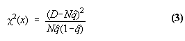
will be distributed like ![]() with one degree of freedom. As before, we have dropped the arguments
"
with one degree of freedom. As before, we have dropped the arguments
"![]() " on the right hand side of
(3).
" on the right hand side of
(3).
The values of ![]() are shown in Table
6.4. Every entry, for each single year of age, will be distributed like
are shown in Table
6.4. Every entry, for each single year of age, will be distributed like ![]() with one degree of freedom. At least,
this will be so if the model is correct and the data are accurate. For a model which is
not correct, so that
with one degree of freedom. At least,
this will be so if the model is correct and the data are accurate. For a model which is
not correct, so that ![]() is not the true
probability of dying at age
is not the true
probability of dying at age ![]() , or if
the data are not completely accurate, then
, or if
the data are not completely accurate, then ![]() may be larger than would be expected from the distribution of
may be larger than would be expected from the distribution of ![]() with one degree of freedom. Thus high
values of
with one degree of freedom. Thus high
values of ![]() may indicate either
inadequacies in the model or inaccuracies in the data.
may indicate either
inadequacies in the model or inaccuracies in the data.
The values of ![]() can be summed over groups of ages. Table 6.4 shows the sums over ages 99-109. If a model is perfect and
the data are accurate, these sums will be distributed like
can be summed over groups of ages. Table 6.4 shows the sums over ages 99-109. If a model is perfect and
the data are accurate, these sums will be distributed like ![]() with 11 degrees of freedom. In practice,
the data are not always accurate and some of the models are far from perfect, so much
larger values of
with 11 degrees of freedom. In practice,
the data are not always accurate and some of the models are far from perfect, so much
larger values of ![]() can occur.
However, their ranking can still be taken as an objective measure of the relative goodness
of fit of the models.
can occur.
However, their ranking can still be taken as an objective measure of the relative goodness
of fit of the models.
Comments on Tables 6.3 to 6.5.
On theoretical grounds, the method of maximum likelihood is the best
method for fitting the models, and the likelihood criterion gives the best method of
comparing their goodness of fit, at least when the data are accurate. Nevertheless, the
chi-squared method is also very informative. For a perfect model and with accurate data,
all the values ![]() in Table 6.4 have the same expected value, namely 1. Table
6.4 makes it easy to see at a glance where the imperfections are occurring.
in Table 6.4 have the same expected value, namely 1. Table
6.4 makes it easy to see at a glance where the imperfections are occurring.
For example, we see in Table 6.4 that many of the largest contributions to the ![]() totals at ages 99-109 are due to high
values of
totals at ages 99-109 are due to high
values of ![]() at the particular ages
99-100. We recall from Chapter 3 that in several countries there are signs of heaping in
the data at these ages. There seems little doubt that the
at the particular ages
99-100. We recall from Chapter 3 that in several countries there are signs of heaping in
the data at these ages. There seems little doubt that the ![]() comparisons are here detecting
imperfections in the data, rather than in the models.
comparisons are here detecting
imperfections in the data, rather than in the models.
Table 6.5
shows the differences between the observed and expected values of ![]() , which are the underlying cause of the
differences in the likelihoods and in
, which are the underlying cause of the
differences in the likelihoods and in ![]() . It is notable that at ages 99 and 100, the differences in Table 6.5 are not very large in absolute terms. Nevertheless, they
are enough to show up in the comparisons. Table 6.5 also shows
some rather large absolute differences in
. It is notable that at ages 99 and 100, the differences in Table 6.5 are not very large in absolute terms. Nevertheless, they
are enough to show up in the comparisons. Table 6.5 also shows
some rather large absolute differences in ![]() at age 109, though these are not so striking in the
at age 109, though these are not so striking in the ![]() comparisons because they are based on
small numbers of observed deaths.
comparisons because they are based on
small numbers of observed deaths.
Tables 6.6 to 6.11
In order to avoid any risk of distortions which might be caused by heaping of deaths at ages 99 and 100, or by the further possibility of heaping at age 109 which is mentioned in Chapter 3, we shall concentrate the comparisons in the rest of this chapter on ages 101-108. At these ages, however, we shall extend the comparisons to all six models.
Tables
6.6 and 6.7 give the likelihood comparisons. Table 6.6 gives the values of ![]() for the Gompertz, Weibull and Heligman & Pollard models, while Table 6.7 gives them for the logistic, Kannisto and quadratic models.
On comparing these systematically, for each of the eight data sets in turn, it is found
that all the totals for ages 101-108 in Table 6.6 are
higher than the corresponding values in Table 6.7. It follows
that, on the likelihood criterion, the logistic, Kannisto and quadratic model all fit
better than the Gompertz, Weibull and Heligman & Pollard models.
for the Gompertz, Weibull and Heligman & Pollard models, while Table 6.7 gives them for the logistic, Kannisto and quadratic models.
On comparing these systematically, for each of the eight data sets in turn, it is found
that all the totals for ages 101-108 in Table 6.6 are
higher than the corresponding values in Table 6.7. It follows
that, on the likelihood criterion, the logistic, Kannisto and quadratic model all fit
better than the Gompertz, Weibull and Heligman & Pollard models.
The same conclusions are even
more obvious from the comparisons in Tables 6.8 and 6.9. The ![]() totals
for the Gompertz, Weibull and Heligman & Pollard models are always higher, and
generally far higher, than for the logistic, Kannisto and quadratic models.
totals
for the Gompertz, Weibull and Heligman & Pollard models are always higher, and
generally far higher, than for the logistic, Kannisto and quadratic models.
It is remarkable, in Table 6.9, how many of the values of ![]() for these three best-fitting models are
less than 1. For a perfect model and with perfectly accurate data, the
for these three best-fitting models are
less than 1. For a perfect model and with perfectly accurate data, the ![]() total for ages 101-108 will be
distributed like
total for ages 101-108 will be
distributed like ![]() with 8 degrees of
freedom. We can hardly expect things to be perfect in practice, but nevertheless out of
the 24 totals in Table 6.9, no fewer than 14 are within the limits
to be expected in perfect cases. In these 14 cases, the honours are shared between the
logistic model (4 cases), the Kannisto model (4 cases) and the quadratic model (6 cases).
Among these three best-fitting models, there is no single model which is systematically
better than the others.
with 8 degrees of
freedom. We can hardly expect things to be perfect in practice, but nevertheless out of
the 24 totals in Table 6.9, no fewer than 14 are within the limits
to be expected in perfect cases. In these 14 cases, the honours are shared between the
logistic model (4 cases), the Kannisto model (4 cases) and the quadratic model (6 cases).
Among these three best-fitting models, there is no single model which is systematically
better than the others.
Tables
6.10 and 6.11 show the deviations between the expected and
observed values of ![]() . When these are
examined in conjunction with Tables 6.8 and 6.9,
it will be found that there are several cases where relatively high values of
. When these are
examined in conjunction with Tables 6.8 and 6.9,
it will be found that there are several cases where relatively high values of ![]() have been produced by relatively small
deviations. This can happen when numbers at risk are large enough to produce strong
evidence that a real deviation exists, even though its size may be small.
have been produced by relatively small
deviations. This can happen when numbers at risk are large enough to produce strong
evidence that a real deviation exists, even though its size may be small.
Table 6.9 shows that the logistic model fits well for males, but not quite so well for females. Table 6.11 shows that the signs of the deviations are consistently negative for females. The implication is that the logistic model for females, when fitted to the data at ages 80-98, falls somewhat below the observed values at ages 101-108. As a result, the Kannisto model fits better than the logistic model, in this instance. This is anomalous, because the Kannisto model is a special case of the logistic model and it cannot fit better, when the two models are both fitted and tested on the same data. Here, however, we are fitting to one set of data (at ages 80-98) and testing on another set (at ages 101-108). We shall return to this point later.
We also note from Table 6.9 that the logistic model appears to fit the cohort data less well than the period data in the case of males, but fits the cohort data better than the period data in the case of females.
Of course, goodness of fit is not the only factor which needs to be taken into account in making a choice between the models. There are advantages in a model which has a theoretical explanation, so that one can understand why it works and the circumstances in which it may fail. In practical applications, simplicity, consistency and robustness are also important.
We shall return to the choice between the logistic, Kannisto and quadratic models later. For the moment, we register the main result of this chapter, that at very high ages all three of these models are decisively better than the Gompertz, Weibull and Heligman & Pollard models.